Converting Your WordPress Website to a Responsive Theme
Now that you understand how important it is to have a responsive theme so mobile visitors have a good experience on your website, you need to know how to make your website responsive.
If you have a WordPress website, you can do this without spending a lot of money.
SEE ALSO: Lower Your Website Bounce Rate with a Responsive Theme
Choosing a Responsive Theme:
When I decided I need a responsive theme for my websites, I contacted the designer who custom designed my real estate website on the Thesis theme. Actually, I contacted both the website designer who created the custom site and the company who specializes in real estate websites who modified it later for me.
Both told me that the Thesis theme that my website had been built on was not responsive and there was no easy way to make it responsive. Basically, we would have had to start over from scratch.
After spending a lot of money on this website in the last few years, I decided to see what my free options would be. I’ve successfully used free themes on this website (Future Expat), and I’m tired of spending so much money on the other one.
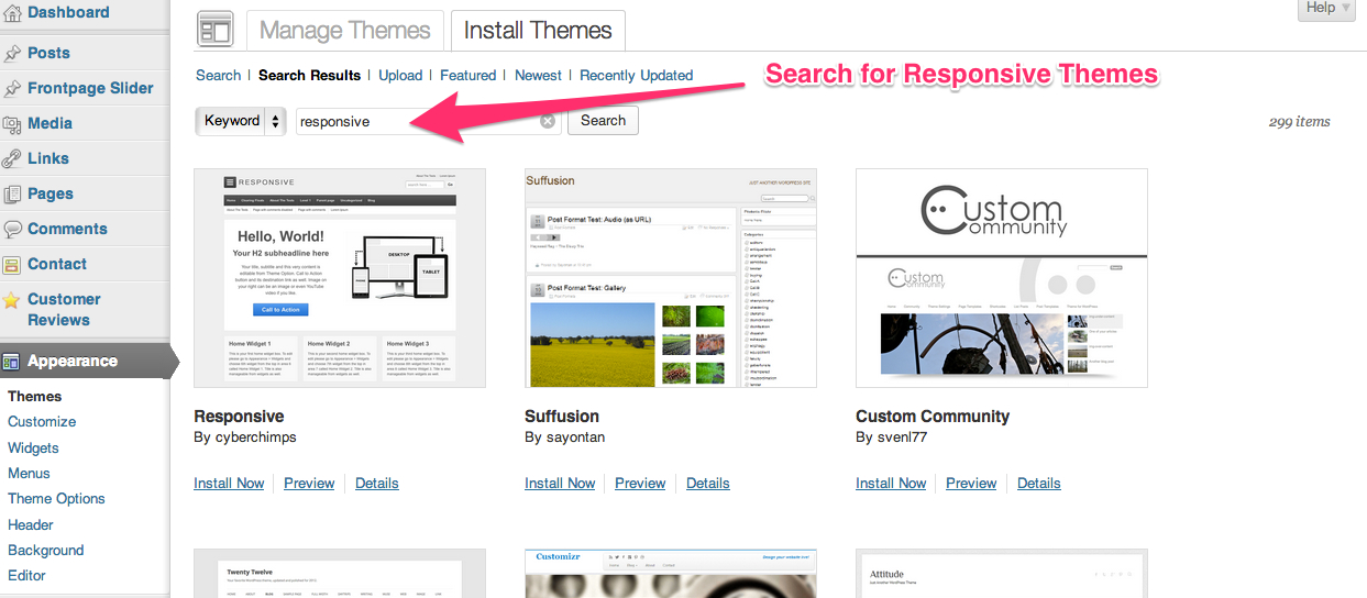 Search for free WordPress themes from your dashboard
As it turns out, there are a lot of options for responsive themes in Worpdress for free.
To switch to a responsive theme on WordPress.org:
- In your dashboard, click on Themes in the Appearance section of the menu.
- Click on the tab Install Themes.
- In the search bar, enter ‘responsive’
- Pick a theme, that you like and install it.
- Preview the theme with the live demo before you activate it. Be sure to check and see what the home page looks like, along with blog posts, pages and category pages.
- When you find a theme you like, activate it.
- Go into the theme options and edit them to match what you want.
- Go to Responsinator and enter your URL. Repeat the process of clicking on the home page, blog posts, pages and category pages on at least the iPhone and a tablet to make sure the site displays well.
- If you don’t like how the site looks on the iPhone after updating all of the available options, either start over by trying a new theme or contact the website developer through a forum and to try to make minor changes that will correct the things you don’t like (see below for more info on doing this).
SEE ALSO: WordPress Calendar Plugin: Add Events to Your Website
Theme Developer Forums Let You Customize Your Website:
Regardless of which theme you chose, there will probably be a few things you don’t like.
Good WordPress themes have developers who will respond to forum posts to help you make minor changes to your site.
Some developers are more helpful than others. And some themes are easier to make the changes to get your website the way you want.
In the process of changing both this website and Arch City Homes to new responsive themes, I did a lot of trial an error. I activated a number of themes only to find that I couldn’t get the sites to look the way I wanted. If you are smart, you would do this at a low traffic time of day. I was so eager to make the changes that I just went ahead and did it, and figured my visitors would suffer through bad layouts for a few minutes, though I don’t really recommend doing it this way.
Responsive Theme Reviews:
Expound Theme:
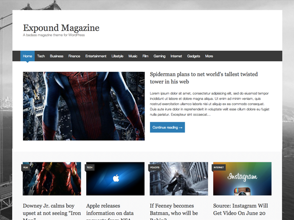
Future Expect is currently using the Expound Theme developed by Konstantin Kovshenin.
There are a lot of things that I like about this theme, and some things that I didn’t like out of the box.
The options are pretty limited and include:
- Site name and tagline – display with font color of your choice or hide
- Background color or image
- Upload a header image (optional)
- Select with WordPress menu you want used at the top of the page
- Home page is either a static page or shows recent blog posts
The theme comes with a single right side sidebar and no access to the footer.
What I like about Expound:
I like the look of this theme a lot. I like the way the most recent post displays on the home page, with the next four posts in a row horizontally and then the next few posts below that.
I like the font and design style of this theme.
Basically, I like the look of this theme really well.
What I don’t like about Expound:
- There is no custom CSS area so you can make code changes to the theme which won’t be lost when you install updates to the theme.
- Since there is no custom CSS area, Jay Thompson helped me go into the theme files to add a copyright in the footer. Unfortunately, when I updated the theme, the changes were lost. Rather than asking Jay to go into the theme files to make changes, I added the copyright info at the bottom of the sidebar. It works, but is not an ideal solution.
- Since there is no custom CSS area, I had to edit the theme files to add the Pinterest code to the header files so that I could use the Pinterest widget. When I updated, it broke the widget. I went back and edited the code again, but it’s a pain to do this with every update. Since then, I discovered a widget called Header and Footer that makes it easy to add code like the Pinterest script or Google analytics code to your site. I plan to install this widget on this site so I don’t have to keep editing the theme files, which is very dangerous and can result in a novice like me breaking the site.
- The footer is not widgetized. I am used to being able to add content into the footer and it really limits me if the only place I can add content that isn’t a page or post is in the single sidebar. I also don’t like that I can’t remove the developer’s name and theme name from the footer.
- The blog posts show the date as a relative date (such as “published 8 days ago”). This was another thing Jay Thompson fixed for me in my theme files, and this one didn’t break when I updated the site. Hoping it doesn’t later since I have no idea how to fix this and don’t want to keep bothering Jay.
- You can’t change the colors of anything other than the title and site tagline in the header, and the background color. I actually like the color scheme of the site, but think it would be a much better theme if there were more color options so users could adjust the colors to match the header and logo.
Even with the list of negatives, I like the theme better than anything else I’ve seen for this website. In a few months, I’ll probably check again to see if there are any new responsive themes that I like which don’t have the same problems as this one.
ZeeNoble Pro Theme:
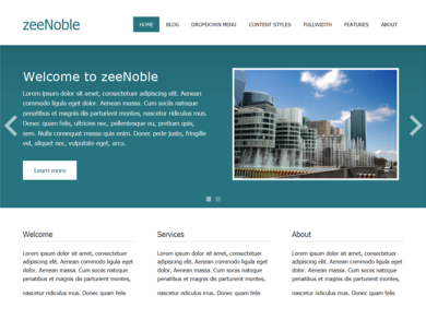
My real estate website Arch City Homes is currently using the ZeeNoble Pro theme by Thomas at ZeeThemes.
I tried a few themes before I settled on this one for my business website. I wanted a slideshow on the home page which allowed me to highlight a few blog posts or pages, and the ZeeNoble theme handles it better than the others I tried. Since my images aren’t always the same size, I was having problems with slideshows on other themes.
I also wanted to be able to use my header and have 3 information boxes like you see in the screenshot above.
I wanted to be able to modify the colors to match my branding and to have blog posts displayed on the home page.
ZeeNoble is free and is a good theme for most users. But, it didn’t allow me to do everything I wanted, so I upgraded to the ZeeNoble Pro theme for just $29.
The $29 fee gets me unlimited use of all of the Zee Pro themes, so if there is a new theme developed later that is a better fit for my websites, I can easily switch without paying another fee.
What I like about Zee Noble Pro:
I really like the slideshow on the home page. I can set how long each slide is displayed and how it transitions, and can have an unlimited number of slides to highlight features I don’t want visitors to miss.
I really like the style of the excerpts on the home page and the ‘read more’ buttons that jump out at you.
The footer is wigetized and you can select any color as the footer background, so your visitors can immediately see that they have transitioned to a different section of the website.
The theme comes with widgets for recent posts and popular posts that I’m using in the footer. It also comes with an impressive array of color options, letting you change the color on just about everything to whatever color you want.
All of these things are great, but what I like best about the Zee Themes is the support provided by Thomas.
I signed up for the forum on his website and he has provided me with instructions and code to tweak the site in about a dozen ways. Thomas lives in Germany, so there’s a bit of a time change between and St. Louis. If I post in his forum early in the day, I usually get a response the same day. If not, I always get a response the next day.
I couldn’t ask for a more helpful developer. For $29, I’ve gotten much more than my money’s worth.
What I don’t like about Zee Noble Pro:
There really are only 2 things I don’t like about this theme.
It would be very involved to change the color of the menu since the code is extensive in order to accommodate the responsiveness to screen size. I would have liked to make the menu items match my header colors, but it wasn’t worth fussing with the code.
The other thing I don’t like is that the site design just doesn’t seem as crisp and polished as on the Expound Theme. The fonts seem a little too big…I feel like I’m reading a large print version of a book. The boxes on the home page below the slideshow don’t have the detail to make them more polished so they just look like squares of color.
I just changed the background color back to white, and I like the site a bit more. Maybe I need to try the same thing with the featured boxes.
Whether or not I can get the look perfect, I’ll stick with ZeeThemes for a while.
SEE ALSO: Which Social Sites Bring Traffic to Your Blog?
Themes I Rejected:
While I did a quick live preview on a number of themes that I decided not to activate, there were 2 themes that I invested a lot of time trying to make them work on the site and ultimately decided I had to find something better.
The themes I tried and rejected were:
I really liked the look of Attitude in the sample site and gave it a try. After playing around with it, I decided that I liked it enough to pay to upgrade so I could modify the color scheme to my Arch City Homes green and blue design. Unfortunately, I couldn’t get the slideshow to work properly. In the end, it wasn’t worth sticking with a theme I didn’t like simply because I spent some money on it.
This is another theme I tried. I really like a lot of things about this theme, but again I had problems with the slideshow. The slideshow issue is that you have to resize all of your pictures to fit their slideshow dimensions. I guess I’m just lazy and don’t want to do that. With ZeeNoble, the image is placed in a box rather than scans the full width of the site, so your images can be the same size as the ones on the actual post.
Another problem with the slideshow is that depending on the color of the image, the text can sometimes be hard to read.
Everyone’s need are different.
These themes might work for you. Or you might find a completely different theme that is perfect for your website.
Whichever theme you use, make sure it is responsive so all of your website visitors get a great experience.