
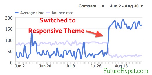
On August 5, I decided it was time to implement what I learned at BlogHer ’13 about responsive websites. Over the next 72 hours, I changed the theme of this website several times.
Half of the time over these few days, the website looked terrible. The colors were wrong. The header was missing or the wrong size. The home page slideshow wasn’t working.
Even with all of the chaos my visitors discovered when they landed on Future Expat, there was a dramatic bump in how many of the visitors bounced (left quickly without clicking on another page). The total time that visitors spent on the site also dramatically increased. At the same time, there were actually fewer total visitors than the week before so this change did not have to do with more website traffic.
SEE ALSO: Lower Your Website Bounce Rate INFOGRAPHIC
Every Website Needs a Mobile Version:
I’ve changed the themes on my websites before and never seen such a dramatic impact on traffic.
The reason the theme change had such an impact this time was because I changed from using the WP Touch mobile plugin for WordPress websites to a responsive theme.
What do this mean?
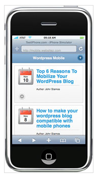
The mobile plugin changes the look entirely of websites. With the plugin, my website was hard to navigate and some of the information didn’t display properly on the smaller mobile phone screens.
A few years ago I attended some training sessions on the need for mobile versions of your website. The instructors insisted that you shouldn’t try to duplicate your entire website on a cell phone. Instead, you should think about what people using their phone would want to do, and only include that information.
I followed the advice on my real estate website, Arch City Homes. This meant that I included information about my home listings, but left out the blog articles.
On this website, most of the information was displayed on my mobile website. I did leave out the travel map because it didn’t display properly.
But times have changed. More and more people are using their phones for much of their internet needs. They interact on social media sites and read articles they discover through shared links.
Unfortunately, when these people click through and land on a WP Touch mobile website, they don’t want to stick around.
Simply put…websites using WP Touch or similar methods to convert a regular website to a mobile website just don’t look pretty. Visitors quickly realize the site is hard to read or navigate and they hit the back button instead of exploring the website.
SEE ALSO: Converting Your WordPress Website to a Responsive Theme
Responsive Themes Result in Website Visitors Sticking Around:
In contrast, responsive websites resize all of the images and design elements so it displays properly on any size device.
As the screen gets smaller, the website changes from having multiple columns to a single column. The image and text size is adjusted for the device to make it easily readable.
The menu displays all of the same content as you would find on a desktop computer and it is easy to navigate. Even the blog sidebar remains, though it is moved below the main content so people have to scroll down to find it.
According to Steve and Shannon Fisher, who led the responsive design breakout session I attended at BlogHer ’13, 30% of today’s internet users report that they access the internet ONLY from a mobile device. These people NEVER use a full size computer.
This number is likely to increase in the coming years. In addition, many people who currently use both a full size computer and mobile devices will shift more of their online time to the smaller mobile screens.
Bottom line…every website will need to have a great mobile website or it will start losing traffic.
What Does Your Website Look Like on a Mobile Phone?
I found a handy website, The Responsinator, which shows you ANY website on multiple devices. You can look up your website or any other website. Just click the link above and change the website URL to your website. Give it a few seconds to reload the website on each device.
The Responsinator gives you a live demo on each device, so be sure to click around to different pages on each device to see what works and what doesn’t display properly.
How Do You Convert Your Website to Responsive Design?
If you are as convinced as I was when I sat in the training session, then your next question is likely how to change your website to a responsive design without spending a lot of money.
If you have a WordPress website, the answer is pretty simple. Check back next week for a step by step guide on how to make the change using free and upgraded themes. I’ll share with you which themes worked for me and which I abandoned even after I spent some money to upgrade.
SEE ALSO: Converting Your WordPress Website to a Responsive Theme


I am on blogger and my blog is mobile enabled. Actually, 79% of my readers are on a mobile or tablet. I’ll be switching to self hosted WP before the end of the year and the theme I’ve picked is responsive and that is one of the major drivers for my selection.
I started focusing on this issue when I started hearing my Facebook friends complaining they couldn’t get on my website when I posted links from their phones. It just took me a while to figure out a solution.
Glad you got are focusing on which theme will look good for your site on mobile devices.
One thing that I learned on my own (i’ve never attend Blogher yet) was that my original banner design took up too much space on the mobile version, so I quickly discarded it and just made my name in a photo with the width being 100 pixels (length doesn’t matter). You’re viewing your website in wordpress mobile but if you were to view it in say chrome or explorer, you would see that your banner is quite large, something you might want to consider in the future.
That’s a really good point. If I ever get around to designing a new version of the banner, I will definitely make it shorter.
Are these rates for the mobile and tablet bounce rates or for your site overall? I was curious if changing to a responsive design for our site would decrease the total bounce rate? Thanks!
Hi Karen, I was curious if the rates were for your overall bounce rates or just those from mobile and tablets? Basically, I wanted to find out if switching to responsive design would decrease our total site bounce rate? Thanks!
The improved bounce rate was for my total site visitors. Obviously, the more mobile or tablet visitors you get the more it will have an impact on the overall bounce rate, as these visitors are likely to bounce off if the site is not responsive than desktop users who are seeing the site as it is intended.